hist(airquality[ , c("Ozone")])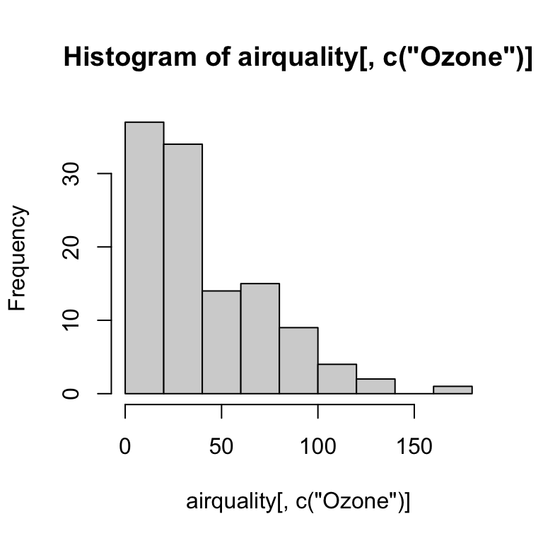
R’s base graphics are great for quick visualization of your data. The main base graphics functions are plot(), hist() and boxplot():
hist(airquality[ , c("Ozone")])
plot(airquality[ , c("Ozone")], airquality[ , c("Temp")])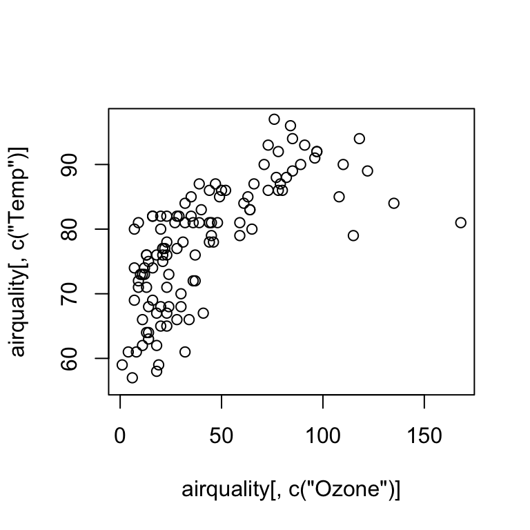
boxplot(airquality[ , c("Ozone")] ~ airquality[ , c("Month")])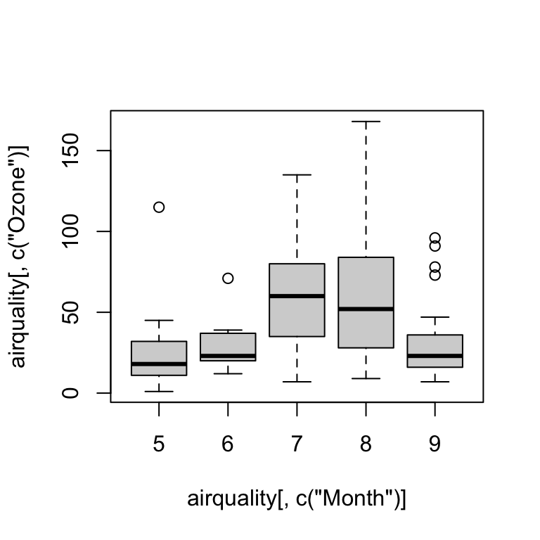
The base graphics system can also be used visualize complex datasets and relationships, but you will need to write more complex code and functions. The ggplot2 package is a great alternative, but it takes some getting used to. It works somewhat differently than base R and graphics.
library(ggplot2)When you create a ggplot, you have to define at least three key components:
data attribute in the ggplot() or geom_*() function call specifies the data set used for the entire plot or individual geom_ layers, respectively.
aesthetics: function aes() is used to map (link) variable names in the data to the axes (e.g., x and y) and visual properties of the graph (e.g., color and shape of symbols).
at least one layer which describes how to render each observation. Layers are usually created with a geom function, e.g. geom_histogram(), geom_point(), geom_boxplot(), and many more.
ggplot(data = airquality, aes(x = Ozone)) +
  geom_histogram()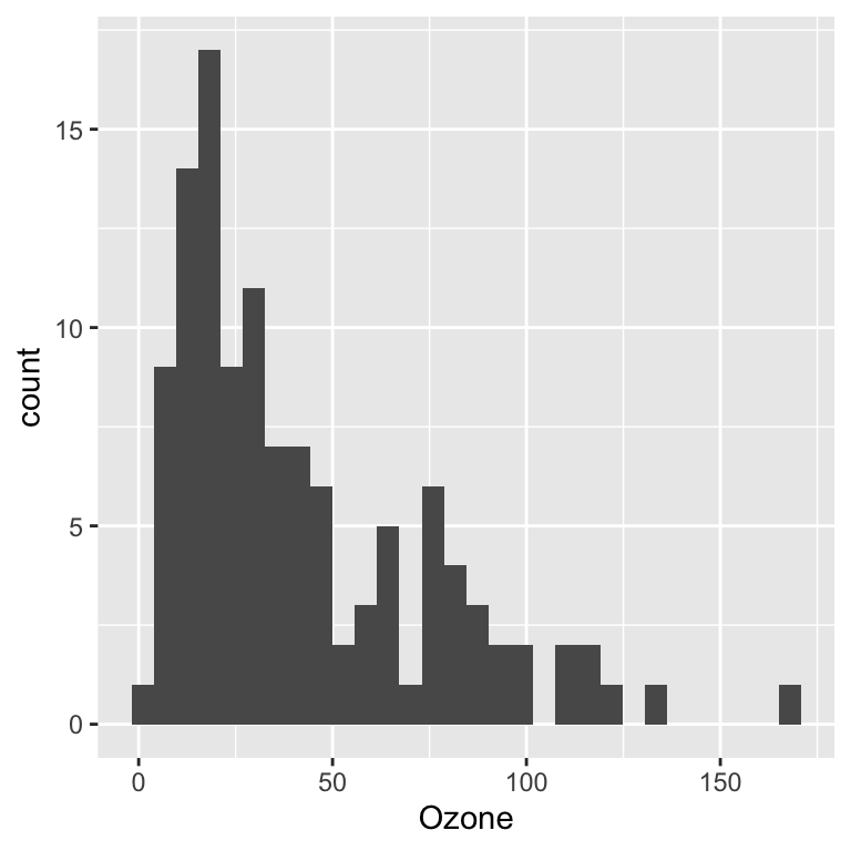
ggplot(data = airquality, aes(x = Ozone, y = Temp)) +
  geom_point()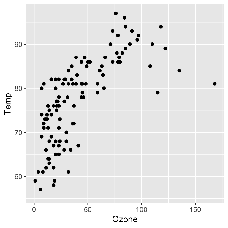
ggplot(data = airquality, aes(x = factor(Month), y = Ozone)) +
  geom_boxplot()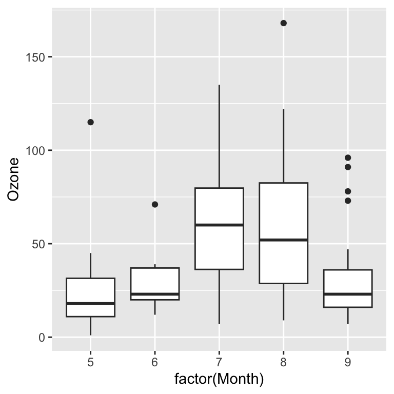
You can use factor variables to change the aesthetics of geom_point and geom_line layers. The following example visualizes the data from different months with different colors.
ggplot(data = airquality, aes(x = Ozone, y = Temp, col = factor(Month))) +
  geom_point()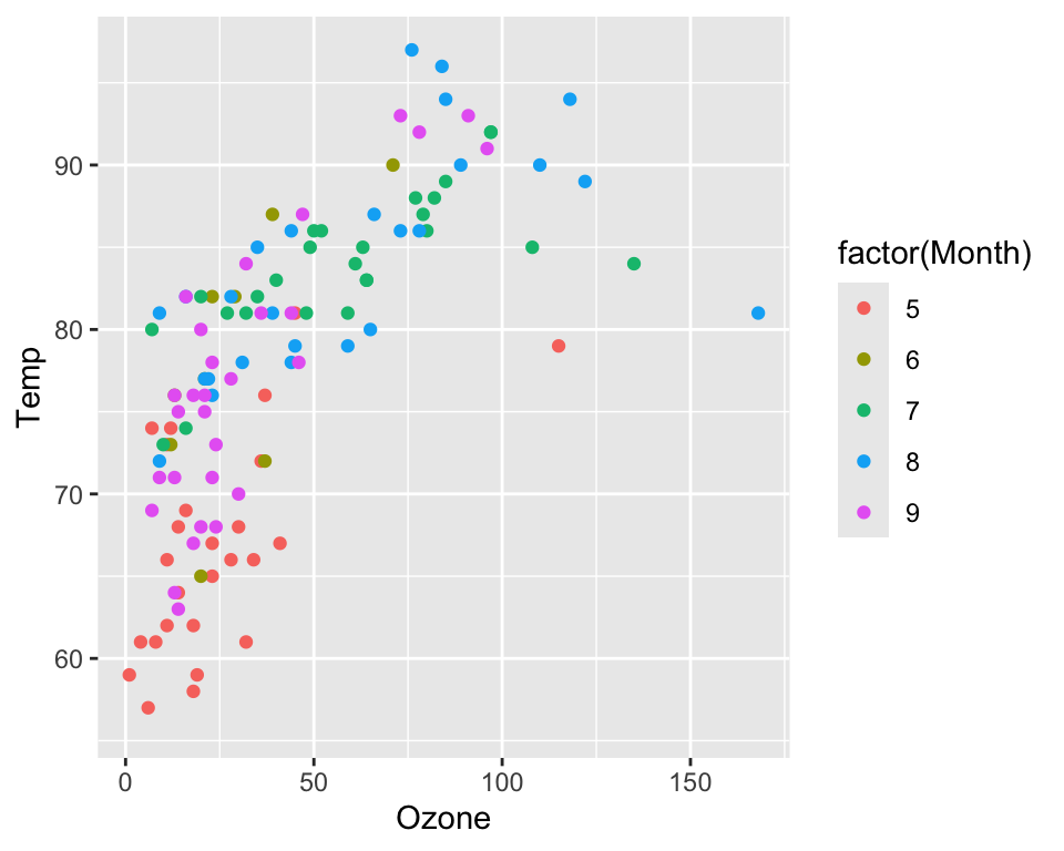
You can also display factors through different symbols (with geom_point):
ggplot(data = airquality, aes(x = Ozone, y = Temp, shape  = factor(Month))) +
  geom_point()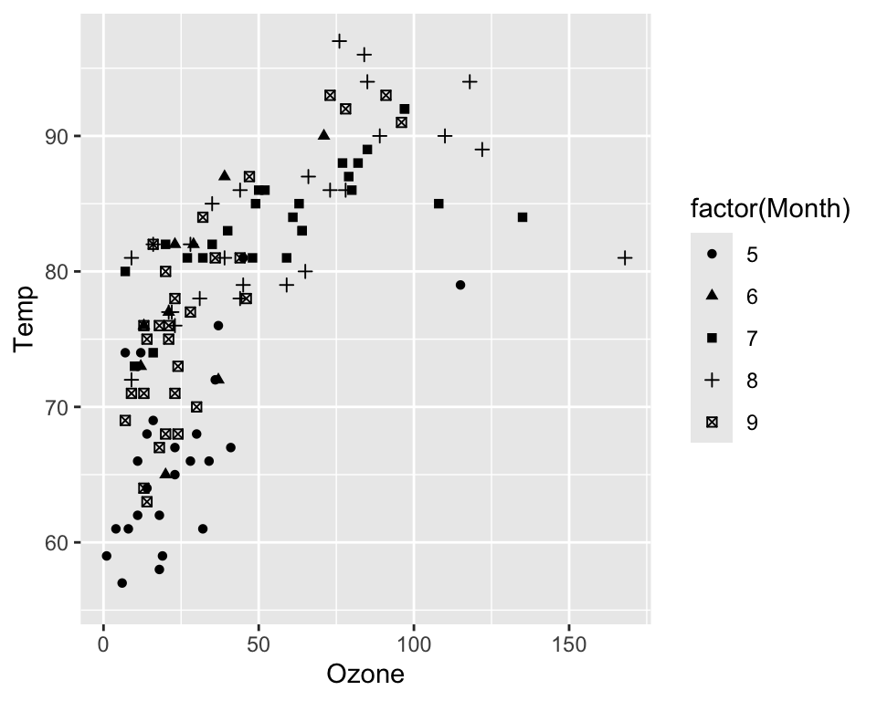
…or the line type with geom_line:
ggplot(data = airquality, aes(x = Day, y = Temp, linetype = factor(Month))) +
  geom_line()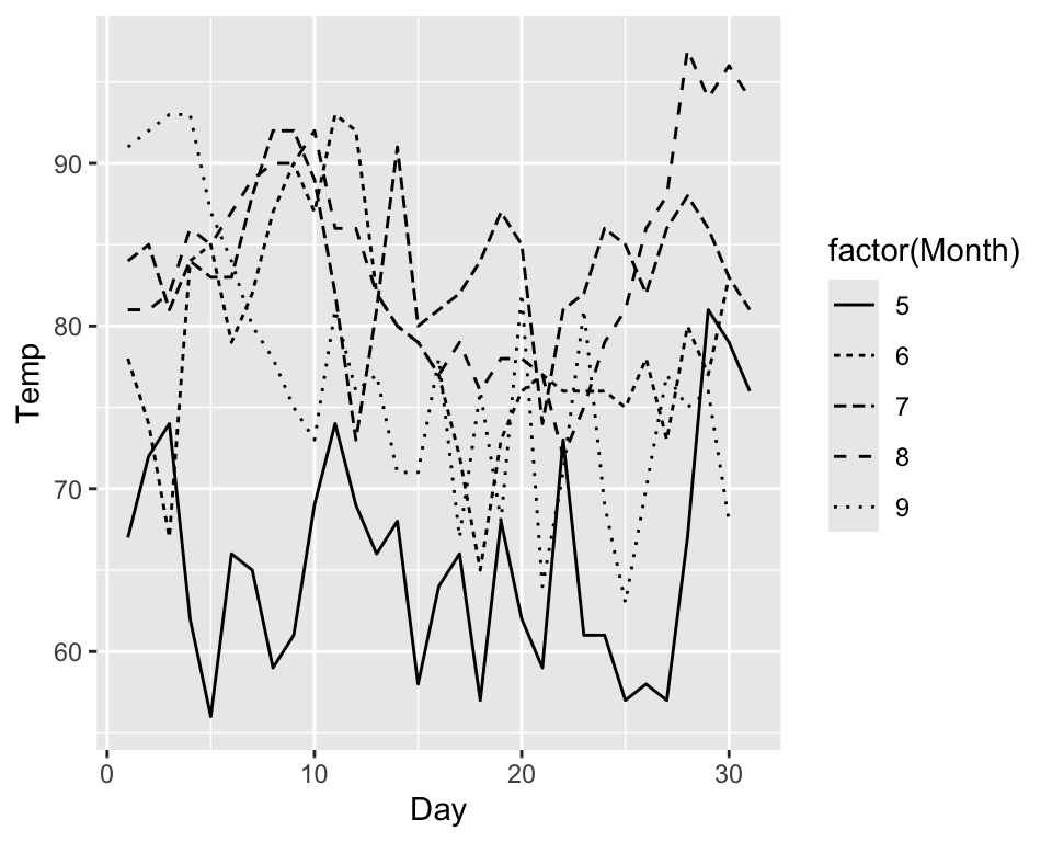
..or the fill color of geom_boxplot and geom_histogram:
ggplot(data = airquality, aes(x = Ozone, fill = factor(Month))) +
  geom_histogram()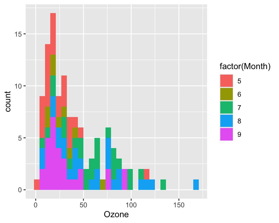
Factors can be used to define colors and symbols. Numeric varibles can be displayed by varying symbol sizes and color gradients:
ggplot(data = airquality, aes(x = Ozone, y = Temp, col = Wind, size = Solar.R)) +
  geom_point()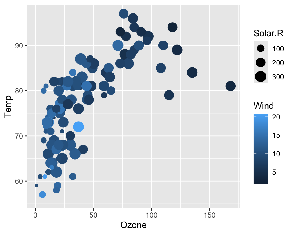
Trellis plots are based on the idea of conditioning on the values taken on by one or more of the variables in a data set.
In the case of a categorical variable, this means carrying out the same plot for the data subsets corresponding to each of the levels of that variable.
R provides built-in trellis graphics with the lattice package.
In ggplot2 trellis plots (here called multi-facet plots) can be achieved with facet_wrap():
ggplot(data = airquality, aes(x = Ozone, y = Temp)) +
  geom_point() +
  facet_wrap(~Month)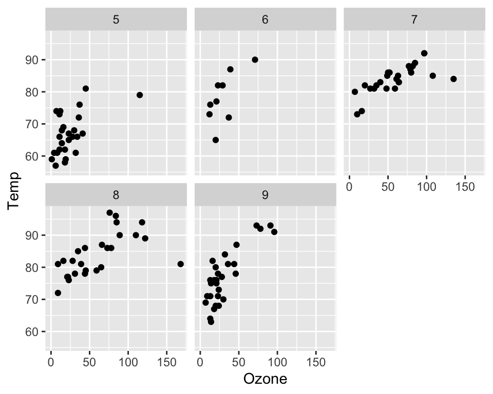
The axes among individual plots (pannels) can be either fixed or variable (free):
ggplot(data = airquality, aes(x = Ozone, y = Temp)) +
  geom_point() +
  facet_wrap(~Month, scales = "free")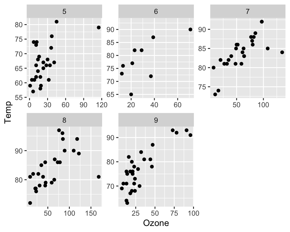
A ggplot can contain multiple layers and each layer can have its own aesthetics:
ggplot(data = airquality, aes(x = Day, y = Temp)) +
  geom_point(aes(size = Ozone)) +
  geom_line(aes(linetype = factor(Month)))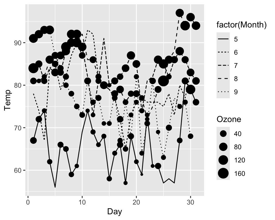
Modify axes titles with xlab() and ylab(), and plot title with ggtitle():
ggplot(data = airquality, aes(x = Ozone, y = Temp, col = factor(Month))) +
  geom_point() +
  labs(x = "Ozone concentration [ppm]",
       y = "Temperature [°F]",
       title = "Relationship between Ozone und Temperture")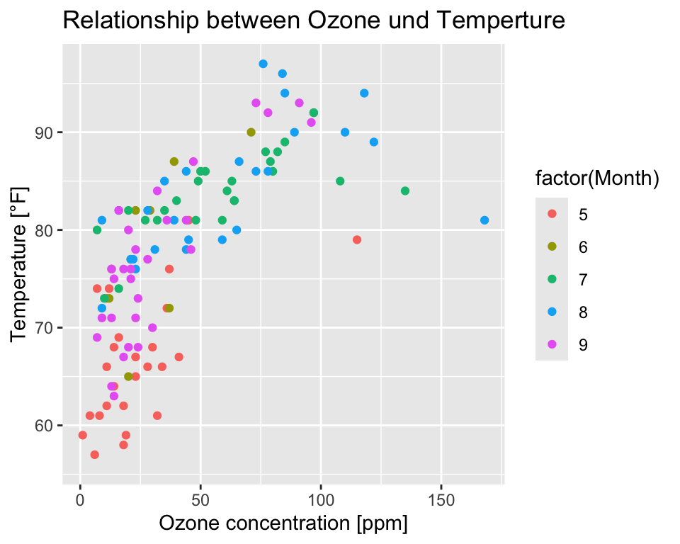
You can combine multiple plots in a single graphic layout with plot_grid() of the cowplot package. First, you must create a graphics object for each plot. Then the two objects are combined with plot_grid().
plot1 <- ggplot(data = airquality, aes(x = Ozone, y = Temp)) + geom_point()
plot2 <- ggplot(data = airquality, aes(x = Ozone, y = Wind)) + geom_point()

cowplot::plot_grid(plot1, plot2, ncol = 2)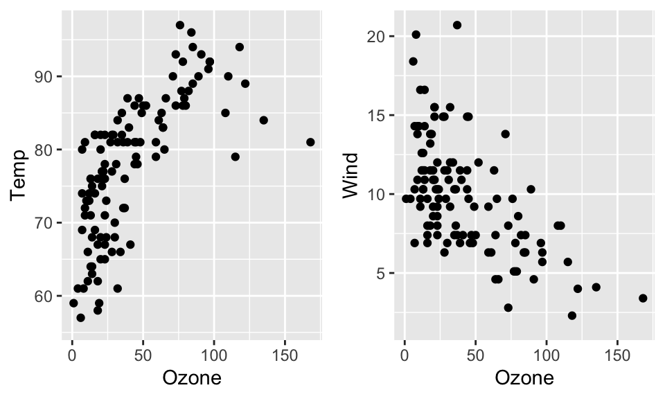
R graphics can be exported into a number of file formats:
To export graphics you need to ‘open’ a new Graphic Device before running your plot functions and close it when you are done. The ‘opening’ function depends on the format (e.g. pdf(), tif(), png(), etc.). To close the graphics device you need to call dev.off().
pdf(file = "Figures/scatterplot01.pdf", width = 7, height = 5)

ggplot(data = airquality, aes(x = Ozone, y = Temp, col = factor(Month))) +
  geom_point()

dev.off()
Alternatively, you can use the ggsave() function.
p <- ggplot(data = airquality, aes(x = Ozone, y = Temp, col = factor(Month))) +
  geom_point()

ggsave(filename = "plot.pdf", plot = p, path = "Figures")